H O M E W E B S I T E E M A I L
Showing posts with label journal. Show all posts

Monday, 17 December 2012

Woolly Thistle


The woolly Thistle is complete. Hooray - this is another tick on my list as the the year draws to a close.


I have my eye on several other thistle species including the artichoke flower, but thank goodness they won't be flowering for several months  so I have a break. In the meantime I have a cool commission - to produce some slightly stylised / abstract wild flowers which are found locally, for a billboard. This will be happening early in the new year. Sadly I have to work from photographs as the clients can't wait for them to flower. Ah well, you can't win them all.


Wednesday, 14 November 2012

Signage

...always excited by beautiful signage!
Also on the South bank.


Tuesday, 13 November 2012

Woza Moya 2


Just two more from the South African exhibition Woza Moya on the South Bank:


There is a lot of finesse in this pared down antelope head; and I really loved the Kaffee Fassett style pouffe.
It looks like a tapestry but the entire thing is beadwork (arranged on facemasks!)

When I was a child and we went to Durban there were always rickshaws "driven" by Zulu's with shiny dark bare chests, imposing antelope horns on their headdresses and tons of beadwork. They used to do a kind of rickshaw dance to build up steam and off you would go along the esplanade. There were also women selling beadwork, exquisitely made, but alas, with such poor quality thread that the jewellery always broke.
Other beaded souvenirs lacked artistic merit. Nowadays there is a lot of collaboration between artists and craftspeople and the beadwork is often done with wire and is strong and as beautiful as ever.

I feel that this sort of artistry won't last because its so labour intensive, so collect it while you can and support the craftspeople.


Monday, 12 November 2012

44 days to Christmas

Good morning!
Thanks to all those who responded with feedback - I'll give you the run down in due course.
I have not quite got the new blog going - I have flu and can't concentrate.

Anyway, today!
I love handmade gifts or gifts that have been personalised. Find a great big preserving jar, and make some brandy liqueur, which will be ready for Christmas. Here is the recipe:
Orange, coffee beans, brandy, sugar


This is one of my calligraphy recipe cards.


Saturday, 10 November 2012

Thank you everyone

This is one of my last blogs at this address and possibly the very last. It's a good time for reflection so please my dear lovely regular readers, can you give me some feedback about the following aspects so that the new blog is just right. If you reply with sentences and add in your bit that would be most helpful.
There is an e-mail box at the top. I think just copy and paste the questions and then reply.


  • 1) First of all, are you a member of my family, a friend with creative interests, a calligrapher or an artist / maker with another discipline.
  • 2) Which posts do you like the most
  • 3) How long should a post be - do I get it right or are they sometimes a bit too long.
  • 4) Do the blogs have too much personal information? (My rationale is that it gives us all a rest from having to produce / find / be bombarded with top quality work; and also it makes me a real person, but if it doesn't work I'd like to know)
  • 5) Are you finding that the blogs are becoming too similar or repetitive?
  • 6) Is there a pattern of development that you can see that you like or dislike as my blogging continues - so far I have written 279 posts mostly since January 1st.
  • 7) What would you like more of?
  • 8) What would you like less of?
  • 9) Anything that you find irritating?


Lastly, the new blog: I have changed servers / templates because I needed to do things I couldn't with the existing one, such as set up downloadable tutorials, sell cards and prints, have a gallery for professional artists to sell work etc. My web designer has fixed the comments facility and hopefully it will also be really easy to subscribe. It has a new clean and fresh look so it should be user-friendly. The keyword search is amazing so I'm learning how to tag properly, but still getting there. This means you can look up all the posts on say, watercolours or recipes.

Thanks for all your support.
For your interest, here are the stats:
I am averaging 2000 page views per month, with 17,200 views since I began:
Last week:
United Kingdom
153
United States
110
Canada
29
Australia
20
Germany
16
France
14
Belgium
8
South Africa
8
Pakistan
7
Finland
6


Love Lin


Thursday, 8 November 2012

Presentation is All - Woza Moya


Woza Moya means "Come Spirit of Change" in Zulu.
Look at and enjoy the lovely artwork and the brilliant presentation!


The art was shown on an arrangement of spectacles, matchboxes, silicone, paper plates and wadding, scrubbing brushes, open books, string, marbles and tiles, cotton wool buds, plastic glasses and green bottles.

I saw this exhibition of Zulu Craft titled Ekaya  on the South Bank in London., shown by The Hillcrest Trust which offers unconditional love to anyone affected by HIV / AIDS. Woza Moya  generates an income form the work of about 300 craftspeople.

Every time I revisit South Africa and meet my old friends I am more and more aware of how people are reaching out and giving of whatever talents they have to help others.

Not long now till my blog gets its new look and new address: www.limetreesstudio.com


Wednesday, 7 November 2012

Computer as a tool - layout - 1c

The blog is moving any day now! Note the new address: www.limetreesstudio.com

This is part of an article I wrote for Oxford Scribes Newsletter earlier this year. I have now written a second article, so why not Join Oxford Scribes rather than wait a few months! www.oxfordscribes.co.uk

Then the calligraphy:

First session: Computer preparation and selecting the nib size.
Second session: Rule up rough paper and do one rough to refine the layout.
Third Session: I prepare two pieces of good paper - watercolour washes or just ruling up.
I also rule up a second rough on layout paper to use for warming up.
Fourth Session: The Day


I ensure that I’m calm and I don’t drink coffee. I start on the layout paper until I’m warmed up, then swop directly to the good paper at any point that I feel ready. 


Because I have a back-up I am less likely to make mistakes. I write the entire piece even if I have the occasional wobble.  Then I do the second piece.
If there are no spelling mistakes, I choose the best and keep the other for my reference journal or I might cut it up to make greetings cards.                    


Tuesday, 6 November 2012

Computer as a tool - Layout - 1b

This is part of an article I wrote for Oxford Scribes Newsletter earlier this year.  www.oxfordscribes.co.uk

Whenever I have to write anything in calligraphy I first type it out in the most similar looking font I can find and play around with the layout, the final overall shape, interlinear distance etc. I always begin on the computer, then write a little until I think my nib size is correct, then go back to the computer to see if it is going to fit on the format size.

If the piece is long, after planning it as a thumbnail,  I might lay it out on an A3 size on the computer and print it off in two halves.


In the piece "This your wedding Day" I had planned to do the final piece on a coloured background in Italic. the title was to be large and within the text body.So to get a feeling for how it would look and the final shape and texture, I laid it out in John Hardy, a cursive script and used Zapfino for the title.


In A is for Ox, I was going to stamp my metal letters into paper then roller over them in black, so I chose Humanist Lt. 19pt and worked out the design. (Needless to say this was after a few thumbnails and trial and error designs)     
It starts getting more interesting tomorrow!


Monday, 5 November 2012

The Computer as a tool - Layout - 1a

This is a series from some articles I wrote for Oxford Scribes Newsletter.
Oxford Scribes is a society that has been going for 28 years and of course in that time has had its ups and downs. In the last two years we have lost some of our founder members and last year Isabelle Spencer passed away leaving a gaping hole in the society.

We have soldiered on and in many ways caught up with technology, colour printing and the needs of the calligraphic community. Oxford Scribes is an exciting society to join with something for everyone. Helen Scholes is editor of the Oxford Scribes Newsletter and is has become a very desirable addition to calligraphy society magazines. Anyway here is my first article (in two instalments) for the first new edition earlier this year - I am now writing the third in the series...join Oxford Scribes and get it hot off the press!
www.oxfordscribes.co.uk/


If you have just been given a commission of too many certificates with too little time, the computer really comes into its own, even using just “Word”.
Ask the client for the names to be sent by e-mail in alphabetical order. This will save you sorting the certificates out later and they will be easier to check. If they don’t do this, put them into alphabetical order yourself using the sort button.

Quick Centering of Names
If you are using Uncials, use Times Roman or Verdana or if you are using Italic, print them out in Times Roman Italic. On the computer, space them with double interlinear spacing and centre them in a single column in the middle of the page.

I’m going to explain this using Uncials.Estimate which size nib will look right e.g. WmM#3.5 and write out the longest name. In this case it is “Patricia Vlietstra”. 
If it looks like a good size for the certificates, write out four more names, two long and two short ones.


 Measure each name and by trial and error (or using the rulers on Word) establish which pt. size in Verdana (27.5) or Times Roman (34.4) will work out at the same length as the names you did using your 3.5nib.

I chose these two fonts because they both bear a resembalnce to the spacing and letter shape of Uncials. If you were using Italic, you could try Time Roman Italic or Ccataneo.

Convert your “Microsoft Word” list of names to to Verdana 27.5. Ignore the “oversized letters” as we are working with length only, not height. Print it out and draw a vertical line through the centres of the names.Cut the list into a long narrow strip by cutting off the blank sides.

Rule up a template for your certificate, with lines on either side to align with your ruler for the names. Also draw a vertical line in the centre of the template to line up with the centre of the certificate and the printed list.

This will probably take an hour. Warm up on layout paper. From now on it should take 1-2 minutes per certificate. Fold your printed name strip beneath the first name and stick with removable sticky tape directly above where you are going to write, and begin. Refold for the second name. Keep writing!

In this article I am looking at using the computer at its most basic level. By following the method I use on certificates you can lay out a family tree, although you might need to do a paste up of digital names unless you have a graphic programme like Adobe Illustrator or CorelDraw. Just keep remembering that the printed letters look horribly large, and we are working with the length,not X-height. I try to use a font that suggests the finished piece to help me visualise it.

This blog address will soon change to www.limetreesstudio.com. I'll keep you posted.


Friday, 2 November 2012

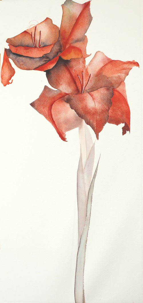
Watercolours - Gladiolus 1

My blog will soon be moving to a different address - www.limetreesstudio.com - I'll keep you posted.


When I was demonstrating the watercolours at the gallery a few weeks ago, I couldn't find any thistles on the first day - they had mostly gone to seed. However I had a vase filled with gladioli on the table so I thought that "would have to do".


You can also see the thistle in the background and how I'm having to finish it from photographs, now that the model I was working from withered. You've also already seen it in a slightly more advanced stage. I'm nearly ready to work on it again. 


Here is the start. I'm going to play around a bit with this one. First I've completed it with a white background and photographed it for my flower cards.


They are in a square format so it will show the top part only. The name will be done in a cartouche and scanned in afterwards because the final original will be long and narrow.


I was going to paint the background in a plain quinacridone yellow but it looked awful, so I added translucent colours. I'm not sure that I like it, but I like what has happened with colour overlays onto the actual petals which were a rather boringly monochromatic red.

My final background will be gold leaf - or Dutch Metal if I can write on it successfully with a pencil like I write on gold. The cartouche will be done on the gold on the left hand side of the stem. Of course it may all look dreadful but is worth trying. Wait and see!

Here is the front of the card which is now a combination of both the above versions - thanks to Photoshop. I don't think it needs a cartouche any more.


You know, I would never had painted the gladiolus if I hadn't been short of subject matter.


Thursday, 1 November 2012

Behold how good...screened and cut letters

My blog will soon be moving to a different address - www.limetreesstudio.com - I'll keep you posted.

Here is the screened piece I started on Friday.


I'm not too sure if I carried off the informal spacing, but I think I'm happy with it. I must say, it was really fun to just draw and cut letters without agonising.
The photo was taken in the winter dappled sunshine to show the embossing. The B has a menorah behind it and there is a design at the bottom. I did four prints on different papers and I like this one where you can see the roughness of the paper through the screening (ampersand, T, g).

I was asked to do this 80th birthday card for a gentleman at Chilton church who is a retired vicar. He has a lovely sense of humour and warmth and is a very intelligent scholar. His parents were missionaries in Japan and as a child of 10, he was incarcerated in a prisoner of war camp; separated from his parents. He was there at the same time as Eric Liddle the Olympic runner from Chariots of Fire. Eric died in the camp. Bruce was reunited with his mother and went home to England. Anyway, I wanted to give him something special. It's A3, so I have made a grey Fabriano cover glued onto a piece of A3 mount board at the top, (like the cover of a writing pad) then I lightly stuck this print into the inside.

I do think that if one makes special cards they should be presented so that they won't get ruined and also so that they can be framed if the recipient wishes to do so. Of course I don't mind what he does with it...!


Wednesday, 31 October 2012

Rope of Words 18 - Tearing the paper.

My blog will soon be moving to a different address - www.limetreesstudio.com - I'll keep you posted.

I've now got my order of the first 25 sheets of paper. Each book will use 13 half sheets plus there'll be a set of prints on their own, plus with mistakes it can easily mean double the amount. One little spill or splodge in screen-printing and it's damaged goods!
I'm hoping to do a limited edition of 6 books, so might eventually use 100 sheets. Gulp!

Time to start tearing the pages. Just look at those beautiful deckled edges.
This is a proper paper tearing knife, also known as a "shoe knife" as it is (was?) used by cobblers and it's quite hardy with a rosewood handle. The blade tapers to fit the handle without any angles or curves which could wreck the paper if it got caught. My bone folder is an extra fine one to score the paper before folding and tearing, then to score it again to fold the folio in half.

I photographed the boned folder pointing at the watermark, which needless to say, you can't detect at all in a photo.


The torn edge is quite finely torn and shouldn't mess up the precision at the top and bottom like a deckled or roughly torn edge would. When you buy the sheets the top and bottom edges are torn in much the same sort of "neat tear".

P.S. Butternut soup tonight - a nod to Halloween - perhaps we should go to movies and skip all the poor little frightened kids running around in sheets dressed as spooks, scaring one another.


Tuesday, 30 October 2012

Rope of Words 18 - Paper, Layout and update

I have chosen the Velin Arches (76cm x 56cm) because the deckled edges down the foredge are spectacular. I'll cut or tear each sheet in half to fold it for a page size 38cm x 28cm. The other fantastic thing about the Velin Arches is that the watermark is not very noticeable. If I find it worries me, I can always to an extra little embossed image in the bottom corner.

Here you can see how I have progressed with the layout from the top plan to the one below. The text will now be in a single column on the left page with a large decorative capital, and a square cut-out near the middle.

Progress on The Rope of Words so far: 
  • Font lower case is designed - I still need to draw the Upper case and have the letters made into a font that I can type.
  • Style of decorative capitals is planned - it will be a coloured screen-printed capital combined with blind embossing.
  • Layout design of folios is designed.
  • I have visited a professional book artist to make sure I'm on the right track and she will oversee my making a dummy book.
  • Illustration ideas are falling into place, although I still need to do some life drawing and then stylise and design each page. 
  • I have some ideas about the style of binding and cover design.

Now I'll start experimenting with one of the illustrations using screen printing and embossing and the rest of the Elva font design is becoming a matter of urgency. This is expensive to do because I'm not technically minded and will only design the letters, vectorise them and plan the spacing.
As soon as I have a number of pages on which I've experimented I'll bind them into the first dummy book.
Time to start tearing the paper. (A little shiver runs down my spine) 
I know, I know, it sounds nerdy and when it comes to paper I'm a total nerd.

Monday, 29 October 2012

Rope of Words 17 - Choosing paper

For newcomers to the blog, I am following through on an artist's book, "Rope of Words",  from beginning to end: the trials, tribulations and hopefully the sucesses.

I went to *Falkiners Fine Papers to get started on some paper trials.
One of my problems was the watermark. I asked about it and some printmakers leave it on to show what good paper it is and that's a personal preference as it would be on the border anyway. However, in a book as big as Rope of Words, there would be a watermark on every second page. Nooooo.


I looked at various printmakers papers in a heavy 300gsm and experimented with blind embossing on damp paper and dry paper.
The blind embossing was only marginally better on the damp paper, (see top right sample) but not worth damping huge sheets. What a relief! (excuse the pun). I'll try dry embossing with a bit more pressure. Bear in mind that each sheet to be embossed is a half sheet 38cm X 56cm, so to screenprint then dampen might be asking for trouble.

Printing paper is 100% cotton and may be textured or smooth, but is more lightly sized than other artist's paper - great for printing on, but not even good for drawing on as it's a little like blotting paper.
Somerset Satin or Somerset Cold Pressed papers were both good, but the sheets have two watermarks on opposite sides diagonally.
BFK Rives was good but only had one really nice deckled edge and the other edge was a torn edge.
Hahnemuhle Etching paper was too soft and stuck in the stencil when put through the press.
Velin Arches is the sample above and the deckled edges (top left) are lovely. The paper is ivory and is exquisite to handle. The deckled edges ran parallel to the grain down both sides. The top and bottom edges were torn.


*Falkiner's Fine Papers was taken over by Shepherd's, a bookbinding company. Now they are moving: "After 25 happy years in Southampton Row, we are moving all the goodies to our bright & shiny new home in Gillingham St, Victoria" This is near Tate Britain but sadly not near the LX lectures anymore. :(


Online Bookbinding & Paper Store
Shepherds, Sangorski & Sutcliffe


Share||

Friday, 26 October 2012

cut & screened letters

I am making a "poster" for an elderly gentleman's 80th - he was a vicar and I was asked to do a card for everyone to sign. It's turned out to be A3, but that was because I had the idea of screenprinting. I'll put it into an folder and they can sign that. His name is Bruce, so I looked for a verse starting with B. The B and the word pleasant will be in orange and the rest in grey. Then there will be some blind-embossing over the B and the pattern at the bottom. (All this is practise for The Rope of Words.)
Here is the stencil, cut from layout paper on my cutting mat. Layout paper works very well as a screenprint mask.


I am trying to "lighten up" to do things more informally, so I just drew and cut these in a morning. Does the informality forgive the spacing on "it is"? Certainly there is a lot of movement because there are numerous diagonals and I didn't really draw proper guidelines. In the end I cut a B and "pleasant" stencil separately as I think it would read as "ehold, how good..." if the B is just blind embossed. My challenge was to do stencil lettering without contained counterspaces which would fall out.
  

And then as I lifted the stencil I saw this beautiful shadow on the cutting mat.


The letters were lying all over the show, so I took a photo of them on my African tablecloth. I've kept them to do a screenprint of them scattered - a kind of alphabet soup.
I'll show you the results when I get there.
It's really nice to do projects which are for fun, because it takes all the stress out of it.


Thursday, 25 October 2012

Text(iles) - Olwyn's Gourd


Olwyn and I played around a bit with her gourd-design since its a theme in her embroidery. In the second one, the O is a gourd and the U suggests a vessel. I've added a photo of a very old gourd I have which was repaired while it was being made. It has since cracked but it is about 50 years old. Olwyn, I would love to see your work on this theme when it is complete!