H O M E W E B S I T E E M A I L
Showing posts with label bookbinding. Show all posts

Tuesday, 4 September 2012

Japanese Scroll Book


When I go on workshops, I love combining my notes into a book or journal of some sort. Otherwise they just get chucked into a drawer and disappear and may never be seen again.
I went on Susie Leiper's course on Brush Lettering a number of years ago at the Sunderland Symposium.
(I'm talking about it now, because I took the scroll out to show you the batik dyeing and thought you'd like to peek inside) Susie lived in China for a number of years and this has very much informed and inspired her lovely calligraphic art. I am passionate about Japanese aesthetics, have studied and created a kimono series, love fabric and was delighted to be able to attend. I really appreciated Susie's approach, because she doesn't try to emulate Chinese calligraphy (not many Westerners can do this successfully) but to absorb what it has taught her.


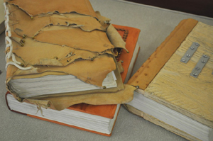
Susie gave me a piece of Indigo dyed Japanese fabric which I used for the binding and I stitched this very large book in a traditional Japanese-inspired style, using my batik dyed paper and fabric on the spine. I then rolled the book and added beads and cord.


I loved playing with brush lettering under expert tuition as I have already done quite a lot of brush work, but its always refreshing to adapt one's approach. The most exciting part for me was learning how to laminate work with paper. I had really investigated this as best I could for my kimono series years prior to this and came up with a trial and error solution - but if only I had known... (bear in  mind that You-tube had not been invented yet)


"Touch of the wnd" was one of the smaller loose pieces inserted into the roll as a loose piece.

The contents of the scroll are the work we did in class, with the finale (back page) being Chinese-style painting for backgrounds using Susie's wonderful large brushes. I have since bought some brushes of my own as you can see, and was given a jade one as a gift. www.susieleiper.com

The little pewter knife is a decorative prop to hold the pages open. It is a Parmesan Knife designed by Carroll Boyes, a South African designer who creates functional art. www.carrolboyes.co.uk


Monday, 3 September 2012

Indigo paper dyeing

I showed you my indigo dyeing workshop photos. I'm always up for experimenting and since Japanese Mulberry paper has such fantastic wet strength, I decided to try dyeing it. With most dyes, the fabric has to be in the dye for a while to absorb the pigment, but with indigo, it is only dipped long enough to get wet.

I started off with batik dyeing, where you draw on the paper with wax then dip it. Of course I haven't rinsed it well to stop the dyeing, but have left it to oxidise. I think - I'm trying to remember as I did these a few years ago - that the pale paper was like that because the vat was running out of pigment and needed refreshing.

I'll tell you a little more about this scroll book tomorrow and let you peek inside.


You can see how I've enjoyed using this paper for bookbinding, but to be honest, it's quite fragile and the edges on the book cases are rubbing off a little. The slip case on the left is covered in batik and dyed paper, and the other is a Shibori fold.
The bottom paper was scrunched around a roll without first being folded and diagonally tied.

This is how to fold the paper with the white circles:
Fold a sheet of Mulberry paper, 36cm x 24cm zig-zag, fan-style so that each fold is 24cm x 6cm.
Then fold zig-zag in triangles so that the folded shape is eventually 6cm on the two sides and approx 8.4cm across the diagonal. (Zig-zag backwards and forwards, don't fold over and over.)


Place a coin on either side of the triangle and clamp it in place with woodwork clamps. Dip it into the dye. 
The outside sections show the coin shape and the white area gradually changes shape as less dye could permeate the paper. 

I've described this, because paper dyeing can be done with ordinary ink as well. I think the piece below was done with sepia and diluted Parker blue, but experiment and see what works well for you. I've always loved the way Parker black gives wonderful shades when diluted, but it fades. 


The bottom paper was folded zig-zag and diagonally tied, then scrunched around a roll. See Friday's blog for a very brief description and photos.


Monday, 2 July 2012

Susan Moor's Books

I had an incredible workshop with Susan Moor, who visited Oxford Scribes.
Her Artist's Books are breathtakingly beautiful and it was very interesting hearing how she developed her by-now recognisable and unique style.


Susan spent every Tuesday in Durham Cathedral collecting images by drawing and created her text by listening, thinking, feeling and writing.  


A part of her final MA presentation was seven simple pamphlet bound books with line drawings. Elegant, understated and the sort of book you don't merely admire, but actively read. These were designed to stir the imagination of many tourists and non-believers who visited the cathedral.


However, it is the journals of her two-year journey that have captivated me (and many others).
Today I think I'll just show you the books and tomorrow we can peek inside them!


For people who are interested in working alongside book artists such as Susan Moor and Ann Hechle, there is a unique opportunity in July 2013. The Sunderland symposium will celebrate the visit of the Lindisfarne gospels and delegates will visit Lindisfarne and Durham cathedral and have an opportunity to produce a unique statement on their own. There are quite a number of you out there who read my blogs, who I can imagine would really enjoy this (including some who love lettering, but are not calligraphers per se!)
I'll be there for sure!


Photos reproduced with kind permission of Susan Moor.


Wednesday, 20 June 2012

Beautiful Foundational


This exquisite little book (10cm square) was made by the late Anne Irwin and demonstrates perfect Foundational combined with versals. When I suggested you decide on your direction , it need not be citations for the Queen. This is also formal work of a fabulous quality and perhaps less daunting! 
The caps saying "Anonymous" are about 1mm in height.
Versals are difficult to master, but are beautiful to look at. The Ramsey Psalter would have been written only 250 years before this poem was created, so this style of calligraphy would have probably still been contemporary. 


SUMER IS A CUMEN IN
Lude sing cuccu!
Groweth sed and bloweth med,
And springeth the wude nu- 
Sing cuccu

Awe bleteth after lomb
Lhouth after calve cu;
Bullue stereth, bucke vereth
Murie sing cuccu!

Cuccu, cuccu, well singes the, cuccu:
Ne swike thu naver nu:
Sing cuccu, nu, sing cuccu,
Sing cuccu, sing cuccu, nu!

Translation anyone? So far I have figured that there is this little cuckoo that sings loudly to announce summer and it is very persistent and possibly annoying (ne swike thu naver nu)?


(Whoops yesterday, - for the first early readers, & subscribers, they sneaked a peek at today's blog. I pressed the wrong button!)