H O M E W E B S I T E E M A I L
Showing posts with label watercolours. Show all posts

Monday, 17 December 2012

Woolly Thistle


The woolly Thistle is complete. Hooray - this is another tick on my list as the the year draws to a close.


I have my eye on several other thistle species including the artichoke flower, but thank goodness they won't be flowering for several months  so I have a break. In the meantime I have a cool commission - to produce some slightly stylised / abstract wild flowers which are found locally, for a billboard. This will be happening early in the new year. Sadly I have to work from photographs as the clients can't wait for them to flower. Ah well, you can't win them all.


Friday, 2 November 2012

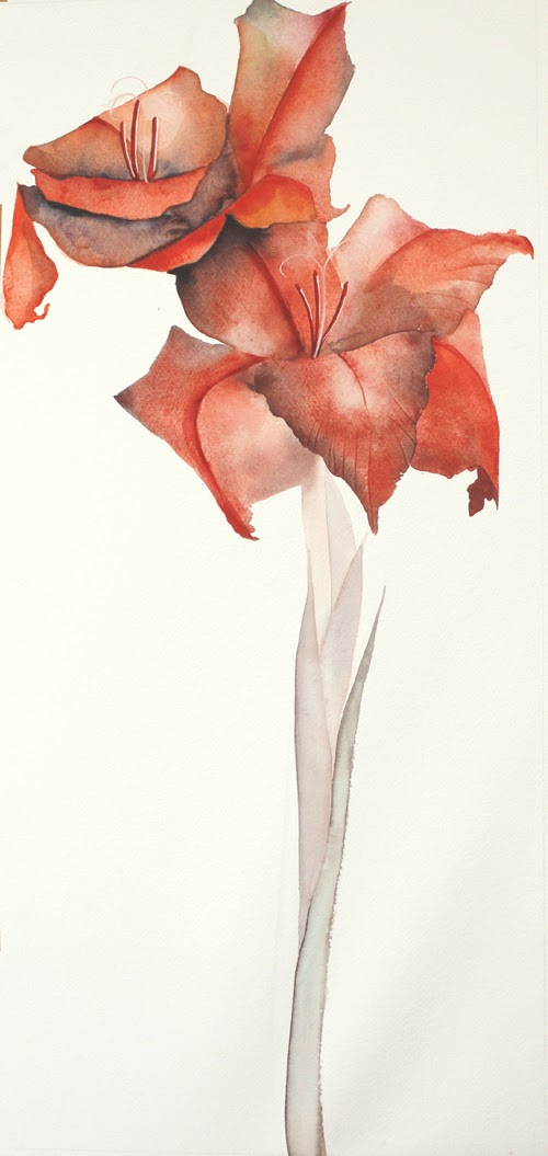
Watercolours - Gladiolus 1

My blog will soon be moving to a different address - www.limetreesstudio.com - I'll keep you posted.


When I was demonstrating the watercolours at the gallery a few weeks ago, I couldn't find any thistles on the first day - they had mostly gone to seed. However I had a vase filled with gladioli on the table so I thought that "would have to do".


You can also see the thistle in the background and how I'm having to finish it from photographs, now that the model I was working from withered. You've also already seen it in a slightly more advanced stage. I'm nearly ready to work on it again. 


Here is the start. I'm going to play around a bit with this one. First I've completed it with a white background and photographed it for my flower cards.


They are in a square format so it will show the top part only. The name will be done in a cartouche and scanned in afterwards because the final original will be long and narrow.


I was going to paint the background in a plain quinacridone yellow but it looked awful, so I added translucent colours. I'm not sure that I like it, but I like what has happened with colour overlays onto the actual petals which were a rather boringly monochromatic red.

My final background will be gold leaf - or Dutch Metal if I can write on it successfully with a pencil like I write on gold. The cartouche will be done on the gold on the left hand side of the stem. Of course it may all look dreadful but is worth trying. Wait and see!

Here is the front of the card which is now a combination of both the above versions - thanks to Photoshop. I don't think it needs a cartouche any more.


You know, I would never had painted the gladiolus if I hadn't been short of subject matter.


Tuesday, 16 October 2012

The next thistle 3 - oh no

This started as a demo and I (unlike superwoman) cannot multi-task. So in the chatting while painting, I made mistakes in the drawing, which I've been correcting ever since.
It's not quite working for me, so I'll put it away for a while and have a think. The leaves are not yet complete, but I need to know where I'm going.


Maybe it is complete. maybe it needs a background, or at least to be anchored to the picture plane.


Thursday, 6 September 2012

Rope of Words 13 - the Woman 2


Everyone has their typical style but having been away from life drawing for so long, I'm not too sure what mine is any more, and I have never stylised work much. When I first came to the UK in 1999 I was desperate to go back to life drawing, and found myself drawn to watercolours as usual. We had an excellent lecturer who made us do 20 minute drawings on full-size sheets of paper. I painted, and mighty fast. Here are the results.


The model was on her back with her legs up against the wall. I never seemed to use local colour, just wildly dipped my brush into any colour- dark for tones and light for tints. I also use a lot of pencil-work in my painting as you can see in the piece below.


But both of these are
a) three dimensional
b) they are complete and words could not really add value.
b) cannot be reproduced in a limited edition.

Okay, I have decided that she is to be nude and two-dimensional. I have now begun to look at stylised drawing and visited the Bayeaux Tapestry replica in Reading. I also looked at Burgert, Modigliani and Matisse.


Wednesday, 5 September 2012

Rope of Words 12 - the Woman 1


Drowsy Substrata
Once upon a thunderstorm
A lightning flash away
Rain promised at the window pane
To take the heat away.
A candle there you brought me
Though the darkness did not flee
Yet it softened at the corners
And in warmth enfolded me.

In a blanket with a candle
At the centre of my heart
All secrets can be naked
In the privacy of dark.
The feelings that lie wordless
Subterranean in my soul
With a flash are in the open
And can still remain as whole 

Megan Kerr aged 17


This was painted with words of a poem by Megan, author of A Rope of Words. She wrote the poem when she was 17 and we were in the Northern Transvaal, South Africa and we had a house with a corrugated tin roof. When it hailed with hailstones the size of golf balls, or rained hard in the afternoon thunderstorms, the banging on the tin roof was dramatic and exciting. I love the way this expresses a very young woman's feelings:

But back to the subject: How to depict the woman in A Rope of Words?
I'm making myself quite vulnerable here because I haven't got to the answer quite yet - but I have a vision of what I think would work. My first idea of collograph which looked so promising in the "head" illustration that I've been using is just not viable because I can't get the finesse in inking up the letters that I would like. (see entry 19thJuly). It is also rather too monotone for me.
I wish I could do lithograph but that is a skill which takes a long time to master and I would rather look at the skills I already have. 

Then there is the visual concept of the drawing. I realised that I've seen the woman in my mind all along as nude. She is obsessed with finding her lost words and I can complete 10 illustrations without any other figures (although I may include the angels further down the line). Only the first one would have her lover with her. If I were to give her clothing it would probably be the typical 14thC style, and I think that would change the whole thing for me.  I would like the final prints to each be a "stand-alone work of art" not a picture to go with a story. Anyway, this is a fantasy story for adults (adults, not Adults)

I remember my art teacher in life drawing classes saying that there were two reasons why we drew the nude:
1) It is only humans who aren't covered in hair and we can draw and appreciate the muscles and understand the structure of the body.
2) Any type of clothing - other than drapery - dates a drawing to a time and place because of fashion .

One of my ongoing quests has been combining letters and art. Art, not illustration, and in such a way that there is an integrated whole, not some lettering with a picture next to it.
I believe that in order to combine letters and form, they both need to have two-dimensionality to work together or  both have three-dimensionality, not a combination of 2D and 3D.  

In the painting above, I made the letters 3-D to go with the watercolour.  I actually wrote Italic letters, cut them out and hung them in a fishing net to get the effect of the title. I was absorbed with kimonos at that stage, hence the title - Kimono, kimono, enveloping sweet form. Then I wrote the rest of the poem on curving lines to give an impression of depth.


Monday, 13 August 2012

Sea-Holly in watercolours


It is complete! (45cm X 45cm) I am so enjoying venturing into unchartered territory where I can't visualise the outcome because I don't know how I'm going to resolve certain areas of detail. I've worked with watercolour a lot but mostly in backgrounds, not in trying to emulate nature or a feeling of nature. So I feel as though I'm at a beginning.

Wednesday, 8 August 2012

Behind the Scenes - Thistle watercolour

At the moment I'm keeping a lot of balls in the air - a couple too many, in fact. You'll see this from the next few entries from designing a font to screenprinting etc.

Having been invited to have a small exhibition of my orchid giclees I thought I'd better do one or two large watercolours as originals and looked around at flowers here because I needed a change from orchids. Many English flowers are typically textural and multipetalled- rose, peony, hydrangea - unlike the simple flowers I like painting such as the strelizia, agapanthus, orchid. I'm sure there is a botanical reason, but anyway after discarding fuschias because of their "little girl colours" I looked at wild flowers - I love poppies, but the massive ones have gone to seed. Buttercups are very sweet and humble but yellow does not scan well for my cards. Then I became fascinated with thistles.


This watercolour is quite large - 45cm, as you can see from the thistle itself - "Sea Holly"
Below is my "behind the scenes" bit. The blueish violets were done with Holbein Violet and W&N Ultramarine blue, green shade. I've discovered a new green - Schmincke Phthalo Green (pronounced Tallo)
It's quite bright and luminescent but mixed with Permanent Rose makes a breathtaking Prussian-sort-of-Green and mixed with Olive and Paynes grey makes a soft subtle shaded green.  I've always found greens to be a problem - Sap Green is weak and fugitive, Prussian Green is fugitive, some greens look just so synthetic and creamy, like green felt etc.

So here are some of my greens: left to right, first row:
W&N Quinacridone Green Gold
Phthalo + a touch of W&N Olive Green
Phthalo + Olive green + W&N Paynes Grey

second row:
Phthalo + Permanent Rose
Phthalo - pure (I don't think I'll ever use it pure)
Phthalo + more Olive

third row:
Phthalo and Olive
Manganese blue and Cadmium Yellow Pale
Olive Green
(you can see these are my own scrappy colour tests - so badly arranged!)
The Quinacridone, Phthalo and Olive are all transluscent and "cabbage" beautifully if water is splashed on them. I also ended up mixing the greens with violet to darken them.
I hope to show you the finished thistle by Friday or Monday.


P.S. Definition of PHTHALOCYANINE: a bright greenish-blue crystalline compound C32H18N8; also : any of several metal derivatives that are brilliant fast blue to green dyes or pigments 

Saturday, 28 April 2012

The Art of Herman Killian

South Hampshire Calligraphers Workshop
Killian's work is epitomized by classical simplicity with an underlying tension within every letter. Beginning with classical forms then moving on to modernising these using ligatures, reversals and other capital forms we will create a piece of work in graphite

LK, Iola, LK, LK, Anon, Olena, Sue, Lesley, Kim, Sharon, Val L, Anon, Angela, Marion, Jan, Val Y., Anon, Joy, Angela, Anon. (I didn't notice I'd scanned Angela's in twice, then did another three to make up the square! Duh!)

After anaylsing Killian's work everybody traced the letters and measured them, comparing them with Trajan Capitals. Guess what? They were just about identical in width.
Keeping this in mind, participants explored their own letterforms drawing from alphabets they were familar with. They composed ligatures, referring to Killian's, mine and tried some of their own variations.

Jan Sambell
 The "project of the day" was a little daunting in that a letter design was to be put into a circular format. Its always good to challenge people and was certainly worthwhile.
Pencil work is beautiful and very yummy, but really does not photograph well. Also, the artifical lighting complicates things, so I had very few photos I could use)

Marion McKenzie

Sharon Robinson

Sharon Robinson - detail

I felt that everyone had the beginnings of a successful piece to take home to continue working on and what is more important, a new understanding of letterforms and their inter-relationships. Thanks for the hard work everyone.


Friday, 6 April 2012

The perfect egg?

Disclaimer: Its not the painting of the egg that's perfect, its for the recipe "The Perfect Egg"

I am illustrating a small book of recipes called Easy-Peasy Breakfasts and Brunches.
So I put an egg on a classic linen teatowel and painted it the way I love painting - loose colour, watery edges, blooming etc. I quite like the painting, but it just doesn't look appetising as a breakfast!


I am sure many food illustrators overcome this issue in different ways. Mine was to go more realistic, which can also be boring. So here's my solution - a little fingerprint person and some lettering.

And here's another one. oops!


HAPPY EASTER EVERYONE

Back to perspective on Monday!